

Pageturners 1

Welcome to Pageturners, a book I’m writing in which I share what I’ve learnt – and am still learning – about comic writing, film writing, novel writing and how new writers can sell their stories. I’ll publish a chapter or a section per week, available for free here on Iconoblast. And I welcome your feedback or questions, so do leave a comment below!
Missed the Pageturners intro? Read it here.
Pageturners 1: The Writer’s Landscape
How does it all work?
Today every comic story would be written as a synopsis and followed up with an outline – an episode by episode breakdown. When I started, it was common to just give the editor a quick summary and then work the story out as you went along. This has certain advantages: it allows for spontaneity and to get deeper into the characters and make changes to the plot as a result. But you can do that anyway with an outline. An outline might still leave characters and plot details to be developed. Too much detail can be a pain to read. Broad brushstrokes are the rule.
A synopsis or pitch could be one page in length. An outline might devote a page to each episode. It covers the thrust of each episode, how it starts and ends. Every episode should feature the protagonist in a proactive role. Sometimes winning, sometimes losing.
So an outline or synopsis will have something in common with a text story but will be more clipped and generally lacking colourful descriptions or purple prose. It might include snippets of dialogue. Mine certainly do, they help me when I’m scripting later.
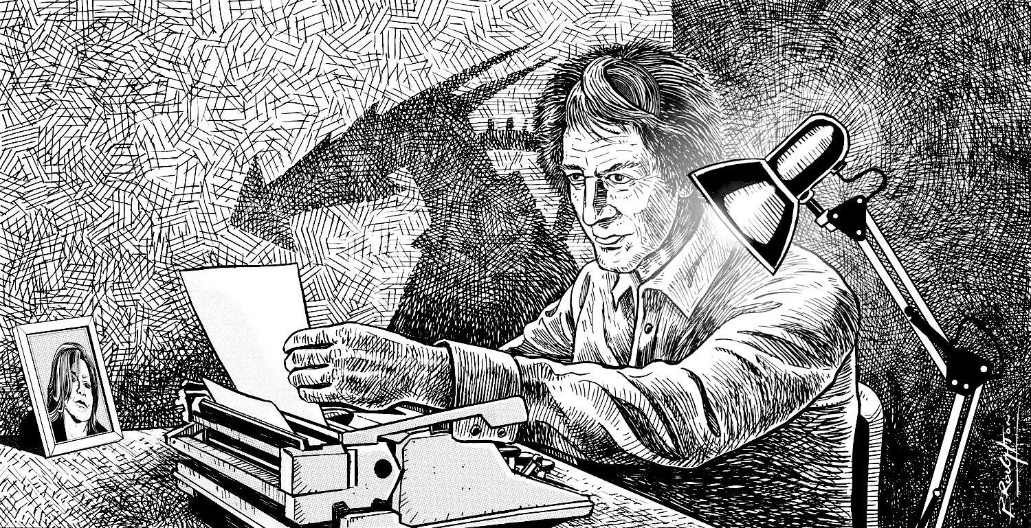
When it comes to the art, I study the past work of the artist very carefully so I can second guess how they’re going to draw a scene. I note their strengths and weaknesses. John Armstrong, who drew Moonchild in Misty didn’t have any weaknesses. He was passionately committed to his art and could draw just about anything you threw at him. If only I was always so lucky!
Another artist might not be so good at facial expressions, or fashions, or vehicles, or action. So, wherever possible, I’ll try and avoid scenes that are difficult for them. Or send them references so their weaknesses can be hidden. Or spend time talking to them on the phone discussing the story, so we work out how to overcome the difficulties together.
Another technique I used on 2000AD at the beginning was to disguise some fairly dull Spanish and South American art with dynamic layouts created by my art editor Doug Church. This was one key reason why 2000AD was so successful. It was labor intensive and a real pain to do, but well worth it. Some writers will layout the page. I do so occasionally if it’s an ambitious scene, or if the artist is not very experienced.
I also often edit the story against the art. This can disguise an artist’s and my own weaknesses. The dialogue then fits like a glove and some boring art might be enlivened with new sparkling dialogue. Or a visual mistake is covered over with a balloon. Some artists like this, others don’t. If they’re a great storyteller, like John Armstrong or Nemesis and Marshal Law artist Kevin O’Neill, it’s not necessary. But I recall I once wrote some heavy dialogue for one artist whose art was overworked with overwhelming detail. I cut my dialogue down so the pages wouldn’t be visually oppressive and busy. He was not happy at my changes, and spent hours on the phone arguing with me, but I still stand by that decision.
Most writers don’t go through this last stage, regarding it as unnecessary or uneconomic. It’s certainly uneconomic! But in a competitive industry it’s one way to keep on top. It also allows me to lose myself in the art and really get a sense of what makes the artist tick.
Good lettering is also part of the art. We used to have brilliant letterers who added a whole new element to stories, like Tom Frame or Jack Potter. But it is in danger of becoming a lost art. The world’s greatest letterer is Ken Bruzenak (American Flagg). He can handle umpteen balloons on a picture, whereas some letterers can’t be bothered and just obscure the art. You can tell when they don’t care about their work – and so can the readers. A bad letterer can kill a story.
On my new project Spacewarp, I’ve gone back to the classic, ‘hand lettered’ look and the results have been terrific and appreciated by the readers. A prime exponent of brilliant lettering is Ken Reynolds. Definitely someone I would highly recommend if you’re looking for a great letterer.
So what’s the process between your initial inspiration and your story’s appearance in the comic?
1. Idea.
2. Synopsis.
3. Outline.
4. Script episode one.
5. Once that’s okayed, write all the episodes. Economically, that’s the best way.
6. Or if you’re unsure of the art, wait to see character sketches or the first episode drawn.
7. Edit the story against the art.
8. The editor may then make further changes if something isn’t clear or maybe needs censoring – e.g. swearing.
9. It’s lettered.
10. Goes to printer.
11. Appears on newsstand. Or in a comic shop. Or digitally.
Script Layout
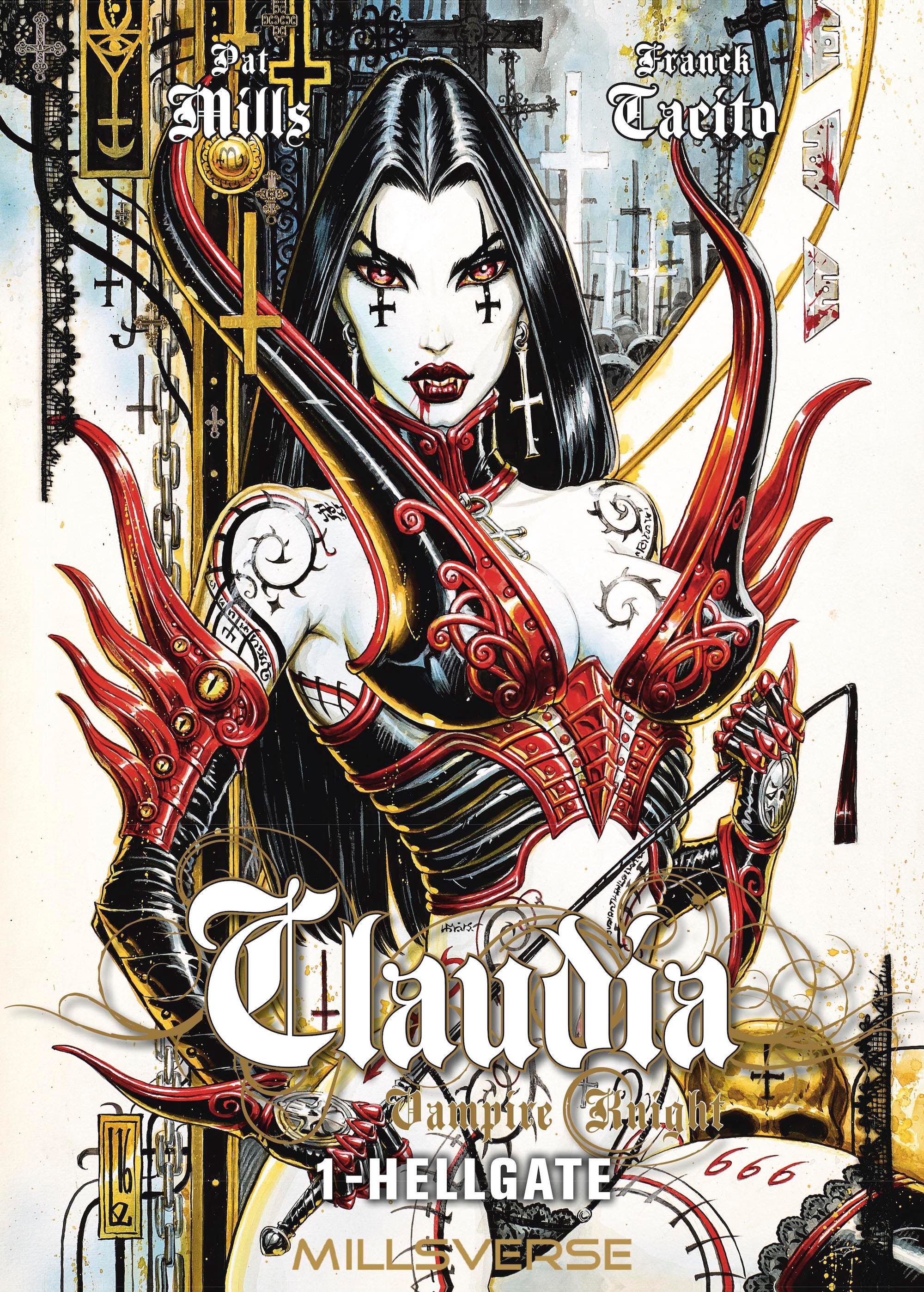
Below are the first three script pages from Claudia Vampire Knight 1: Hellgate. Claudia 1 is now available in English on Kindle, so it’s possible to compare this script against the art. The story is set in 2002, which is when I wrote it. It’s a six volume series and I only wrote volume six last year. That’s how long comics can take to come together!
Every story and every script is different. Some writers’ descriptions are minimal, others are complex. If there’s an image available of, say, a room or a building, I think that’s more useful to the artist than me writing 300 words on the subject, which can break the flow of the script. TV and film screenplays and theatre play scripts tend not to have long descriptions, but that may be because they have set and costume designers. In comics, those jobs have to be shared between the writer and artist.
The heaviest descriptions I write separately as notes and they are not featured in the script below because they were truly voluminous!
PAGE ONE - TITLE PAGE
Suggestion: A smiling Claudia is wearing a full length dress, just after she has been made a Vampire. The Elizabethan style dress, or similar, is fairly full and typically vampiric. She is baring her fangs and maybe drinking from a goblet of blood.
But Cryptos is coming out from under her dress , lifting it up, and peering evilly out at the readers! (Think of the dwarf in the film Tin Drum!)
Cryptos has been standing up under her dress! Although it might look safer if he was crawling, but maybe not as funny.
PAGE TWO - LEFT HAND
1. Interior of Claudia's bedroom. Early morning. October 2002. Claudia lies on her bed. She is dead.
She has been half cremated by spontaneous human combustion.
She was wearing a nightdress which has partly burnt away. She was 58, an attractive woman, but she'd put on weight, had wide hips – so this will contrast with later pages when she is young again. She had good, smooth skin and silver blonde hair, shortish and respectable. Some of her skin and hair would have escaped the spontaneous combustion.
Her expression is surprisingly peaceful considering she has just been burnt alive.
As in typical cases of spontaneous combustion, the bed has been partly set alight, but nothing else has caught fire.
Sunlight streams into the room. The cheerfulness of a bright Autumn morning contrasts with the horror of the scene
Maybe some of the photos I mentioned on the walls.
Her pipe is on her bedside table. She doesn't smoke it now, except in the temple, but this pipe is her visual trademark and we will see more of it later. In her Beatnik/Hippie days she smoked the pipe when she was torturing her victims. It is a long thin pipe, like a sailor's white clay pipe, but more individual if you can find a more interesting design. It's long and thin so that it has a "feminine" quality about it. It is not a drug pipe. She would smoke normal tobacco in it.
TOMB PANEL: GIPPESWICK, ENGLAND. 2002.

2. External view of Claudia's house. Early morning. 2002. Her house terraced or semi-terraced. Maybe on a hill. Signs of Autumn - most of the trees have lost their leaves. Claudia's daughter - Carly - has just got out of her boyfriend Jim's car. A modern but small economy car. They have been out jogging together. So she is wearing running shorts and a tee-shirt. She has a sports bag with her with more clothes in case she got cold.
She and Jim both look very happy. She is 20; he is 22.
CARLY: I CAN'T WAIT TO TELL MUM THE GOOD NEWS.
3. They kiss
JIM: SEE YOU LATER, CARLY.
4. Interior Claudia's house. Carly has just entered and and calls up the stairs. The hall is small but elegant. There could be some of the photos I mentioned.
CARLY: MUM? GUESS WHAT? JIM'S ASKED ME TO MARRY HIM!
5. Close in on excited Carly.
CARLY: AND I SAID YES! I SAID YES!
6. Another view of Claudia's incinerated corpse
CARLY'S VOICE: WE WERE ON OUR MORNING JOG AND WE REACHED MY "INDIANA JONES BRIDGE" ! YOU KNOW THE RICKETY ONE OVER THE RIVER? AND HE PROPOSED TO ME THERE!
PAGE THREE
1. Carly runs excitedly up the stairs
CARLY: HE GOT DOWN ON ONE KNEE! IT WAS SO ROMANTIC!
2. She gets ready to take a shower.
CARLY: AND HE THINKS HE'LL BE MADE MANAGER OF THE SPORTS CENTRE WHEN NICK LEAVES! SO WE'LL BE ABLE TO AFFORD A MORTGAGE SOON!
3. Another view of the dead body. This time - a close up of Claudia's horribly burnt face
CARLY'S VOICE: ISN'T THAT WONDERFUL, MUM?
4. Carly continues to get ready to take a shower.
CARLY: AND I'VE ONLY JUST LEFT COLLEGE! AND I'M NOT EVEN TWENTY ONE YET!
5. Carly happily enters her Mum's room
CARLY : MUM... ? ARE YOU AWAKE...?
6. Inside the room. Carly sees the horribly burnt body and screams.
CARLY: AAAAAHHH!
READER FEEDBACK
Getting reader’ feedback on your work is crucial and it’s a difficult and subjective business, primarily because they may tell us things we don’t actually want to hear.
It’s relatively easy with younger and mainstream readers where it’s possible to recognise and accept a consensus of opinion. And those readers tend to be more transparent and agenda-free. Hence the success of the old school ‘voting coupons’ in comics, which professionals often disliked because it was giving them feedback that was not always to their liking. Hence why they were eventually done away with as being ‘too juvenile’. Yeah, right.
With older readers and especially hardcore fans, they can be much tougher to make sense of. Fans sometimes, for example, like a story or art because it’s by a ‘name’ creator, even if it’s not very good, or it’s a story that they feel they have to like because everyone else does. Kids are more honest and, in my experience, more open to new stories. They won’t flatter a creator’s ego so easily and will simply tell you how it is.
There will be readers of Pageturners who may not like such a conclusion, but it just happens to be the truth.
Personal bias is the single biggest danger to watch out for in analysing reader polls (see below) and in creating comics. It’s the readers’ voice that is paramount, not the creators. The creators must come second to their audience.
But often today it’s the other way around and this has led to the decline of mainstream comics, a massive fall in comic circulation and the rise of low circulation comics which may be genuine self-expression, but are more arthouse than popular culture.
I’ve used a variety of methods of getting feedback over the years:
1. Traditionally there were the reader vote coupons in comics, which were a very accurate view of which stories were successful. The recorded results, noting stories’ rise and falls in popularity, were almost works of art on an editor’s wall. They could seem rather anal but they were accurate. An editor would regularly phone creators to reveal whether their story was popular in the vote chart and even which episodes they liked the most. There was a certain fear and even anger from creators – because readers tended to like action over plot. So subtle was invariably trumped by mayhem. This could be exasperating, but if you want to work for a big audience, rather than your friends and relatives, those are the rules and the trick is to find a way where there can be action and complexity. The votes were so important they were sometimes rigged when there were differences of opinion between editor and assistant editor over which stories and artists should be in the comic. On at least one occasion the votes were rigged to keep Judge Dredd in 2000AD.
But on 2000AD, after a few years a split developed between a minority of fans who liked the more cult and sophisticated artists and stories, and the majority of readers, who favoured the more classic stories. It was the latter who generally used the voting system and some fans would sneer at this juvenile expression of opinion. They would make their own views known at conventions, signings or in letters and eventually their views became more important, even though they were still at that stage the minority.
In my view it was a fan coup d’etat, which worked in the short term, but in the long term was commercially disastrous. Not a popular view, I know, but sales bear it out.
2. The forums are one valuable source today and also comic websites and conventions. Plus readers’ letters.
3. But for a mainstream or young adult market, that feedback is probably too specialised or too adult. So in 2012 I did a straw poll of seven local 8-11 year olds to see if they would be interested in Misty-style stories today. The results were very positive. I’ve since carried out similar straw polls on Spacewarp readers with equally positive results. Some things that they didn’t like – like an exposition page, ‘unclear’ art (‘like my dad’s comics’), were duly noted. If I needed to, I would do the same today.
4. When I started 2000AD, I arranged for a rough first issue to be shown to a class of eleven-year-olds. The response was very positive, which was just as well because it was too late to make any major changes! But I think we did make a few minor alterations. However, it’s worth saying that focus groups should not replace an editor’s personal vision. Feedback is important, but you’re not writing by committee. Creating a comic is not a democratic process!
It’s also possible to allow personal editorial preference for cool stories to get in the way of readers preferences. I knew it would take some time for cool Judge Dredd to catch on with 2000AD readers, so in the meantime I gave them MACH 1, a six million dollar man, who was more accessible, and was the number one story for the first couple of months.
This personal preference problem applies to girls comics as well. So when I worked on Romeo, a romantic companion story paper to Jackie, we were fed up with the traditional romantic artwork of artists like Badia, Galvez and Romero. It just seemed corny and old fashioned to most of us young editorial staff. So we welcomed a new British artist who brilliantly depicted modern, cool British teenagers in a tough biker story.
We were wrong, wrong, wrong.
Our conservative young readers far preferred the traditional heroine with big hair and doe eyes because it was dreamy, escapist and romantic. That was a lesson I’ve never forgotten. You have to change readers’ perceptions in order to modernise comics, but gently and in sympathy with their preferences.
Similarly on Battle, John Wagner (creator of Dredd), and I wrote a great Rat Pack story. Beautifully drawn by Carlos Ezquerra, it had well-researched techno detail and a relatively sophisticated story. To our chagrin, it wasn’t popular. The next week, having run out of time, John and I quickly threw together, in just one afternoon, a really crappy Rat Pack story set in a Gestapo torture cell with every medieval torture cliche imaginable. Worse, it was drawn by a C-list artist, the only one who was available in the time. To our astonishment it was hugely popular with the readers! It was a harsh and humbling reminder that the readers may have different, lower or simpler expectations to us ‘cool’ creators.
Despising the readers’ verdict is for elitists, who will doubtless love the French expression: ‘The smaller the audience, the better the film.’ It’s not a good idea for writers who want to make a living in popular culture.
So it’s vitally important to really study the market, the demographic, and what readers are looking for. They pay our wages so we must listen to them. That’s how I’ve managed to stay in business while at the same time still planting subversive and anti-establishment ideas in the readers’ minds.
5. Sales, of course, are the ultimate feedback. And not just the actual physical sales, but – in the case of newsstand sales – the percentage sold as opposed to being returned and pulped. We found on Spacewarp the percentage of our actual sales was significantly higher than our science fiction comic rival, which was most encouraging. It told me we’d got it right.